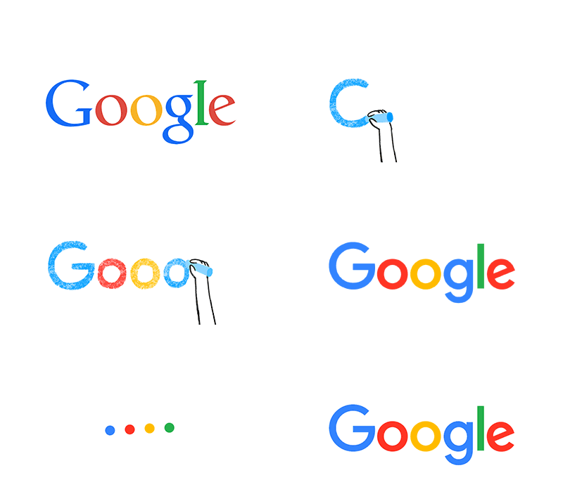
Google announced the change on its official blog and illustrated what was different via a series of animated gifs. It said the revamped logo was “simple, uncluttered, colorful, friendly” and represented the best of Google.
And as posted by Tamar Yehoshua, VP, Product Management & Bobby Nath, Director of User Experience on googleblog.blogspot.com, he said, this isn’t the first time we’ve changed our look and it probably won’t be the last, but we think today’s update is a great reflection of all the ways Google works for you across Search, Maps, Gmail, Chrome and many others. We think we’ve taken the best of Google (simple, uncluttered, colorful, friendly), and recast it not just for the Google of today, but for the Google of the future.
You’ll see the new design roll out across our products soon. Hope you enjoy it!
What Google said of the new logo: “We think we’ve taken the best of Google (simple, uncluttered, colorful, friendly), and recast it not just for the Google of today, but for the Google of the future.”
Apple
The rainbow apple may be a logo of the past, but Apple paid homage to its colorful roots in its new iTunes logo, which was released in June.
Yahoo
Yahoo unveiled a new logo to depict its “renaissance” under its new CEO, Marissa Mayer, in 2013. One important thing stayed, though: its iconic exclamation point!
AOL
“Our new identity is uniquely dynamic. Our business is focused on creating world-class experiences for consumers and AOL is centered on creative and talented people – employees, partners, and advertisers,” AOL CEO Tim Armstrong said at the time.
AT&T
The telecommunications company has kept the essence of its logo while updating it for a more contemporary user base.
Microsoft
Its time as “The Facebook” has long passed, but the social networking behemoth has more or less kept its look. On July 1, Facebook updated its logo once again, slightly thinning the font and rounding out the lower-case “a.” Did you notice?
“From now on, this bird will be the universally recognizable symbol of Twitter. (Twitter is the bird, the bird is Twitter,)” reads a post from 2012 explaining the platform’s logo evolution. “There’s no longer a need for text, bubbled typefaces, or a lowercase ‘t’ to represent Twitter.”
Source: US NEWS


